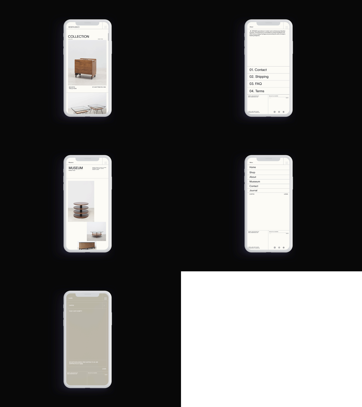
Espasso | Mid-century modern furniture rebrand
The Brief: A refreshed brand identity for Espasso, a premier resource for mid-century modern Brazilian furniture based at Netil house London.
Outcome: The new Espasso branding explores modernist aesthetics through minimal design. Layouts populate a 12 column grid across all collateral, resulting in consistency across channels. Warm colours are used in tonal variations, with greys, beiges and off-white textured Colorplan stock giving a human touch. The logotype has been crafted by merging two existing fonts, cleverly nodding to the two aspects of the Espasso business. I represented the functionality of midcentury furniture by using the consonants and punctuation in Suisse Intl Regular, while the more artistic side is represented through Ace Regular, using the vowels and numbers, the most creative part of the alphabet learnt in childhood. The strength of the identity lies in the pairing of an esoteric, midcentury-inspired logo with slick, minimal art direction.


