Ways of Making | Brand Identity for creative mindfulness workshops
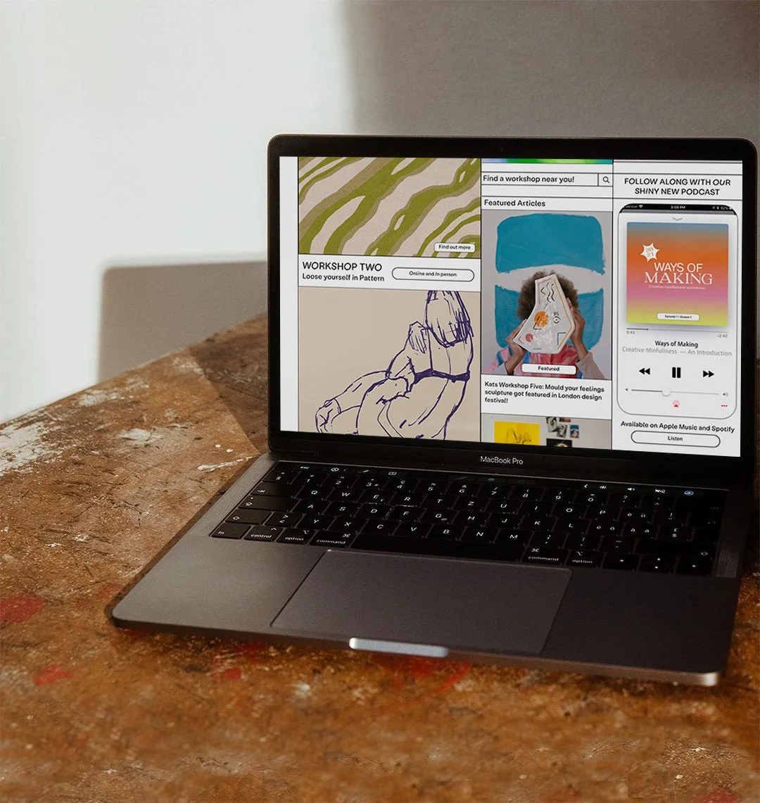
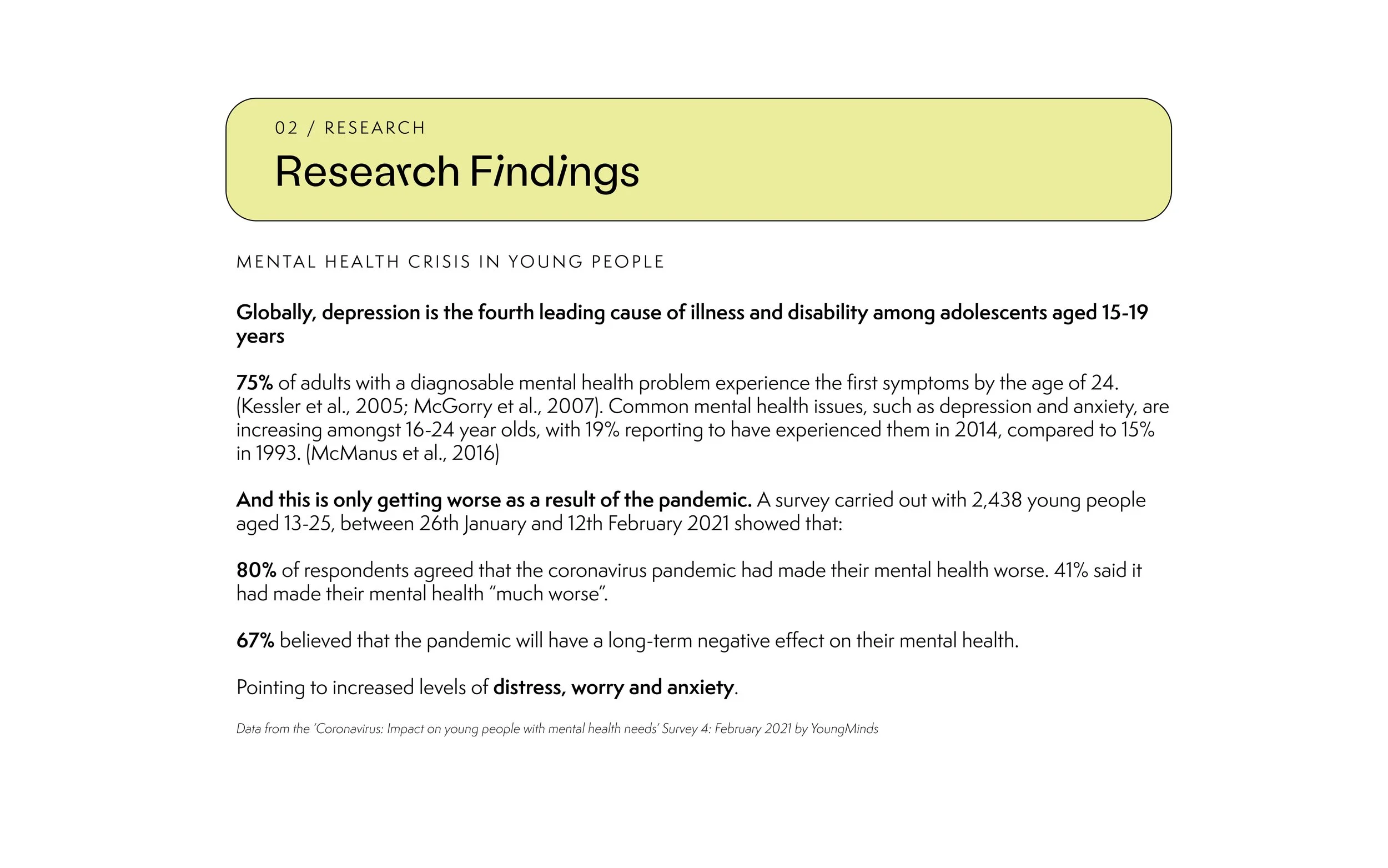
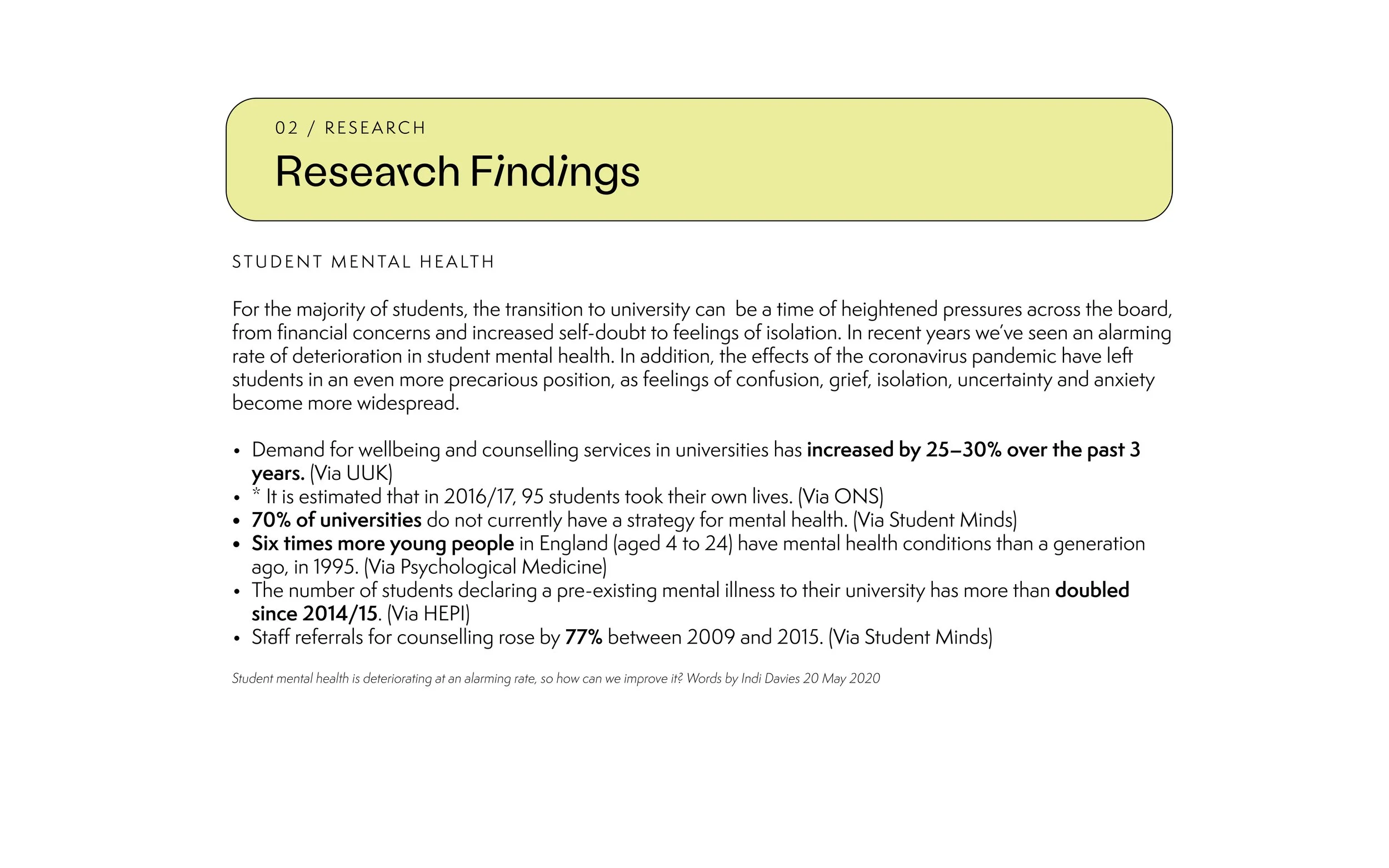
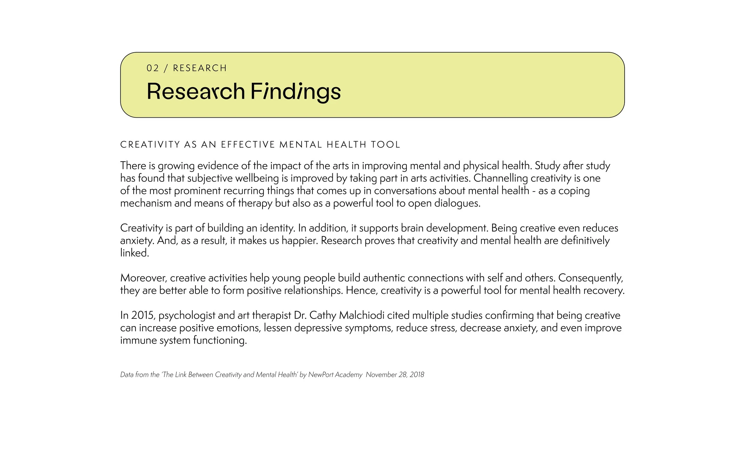
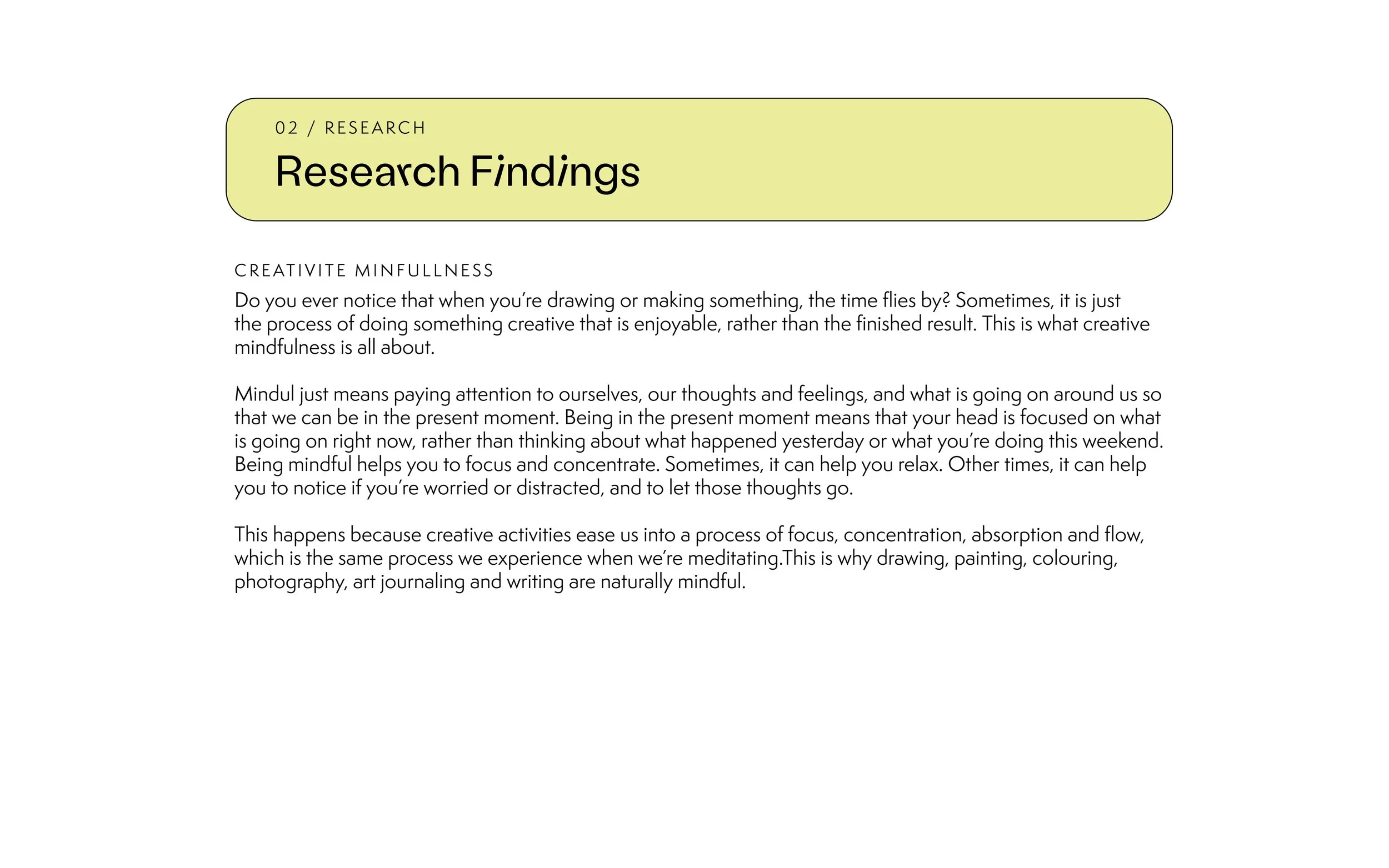
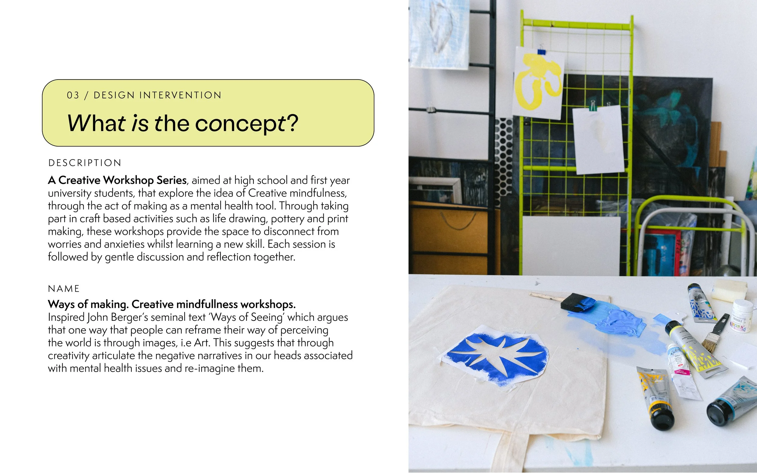
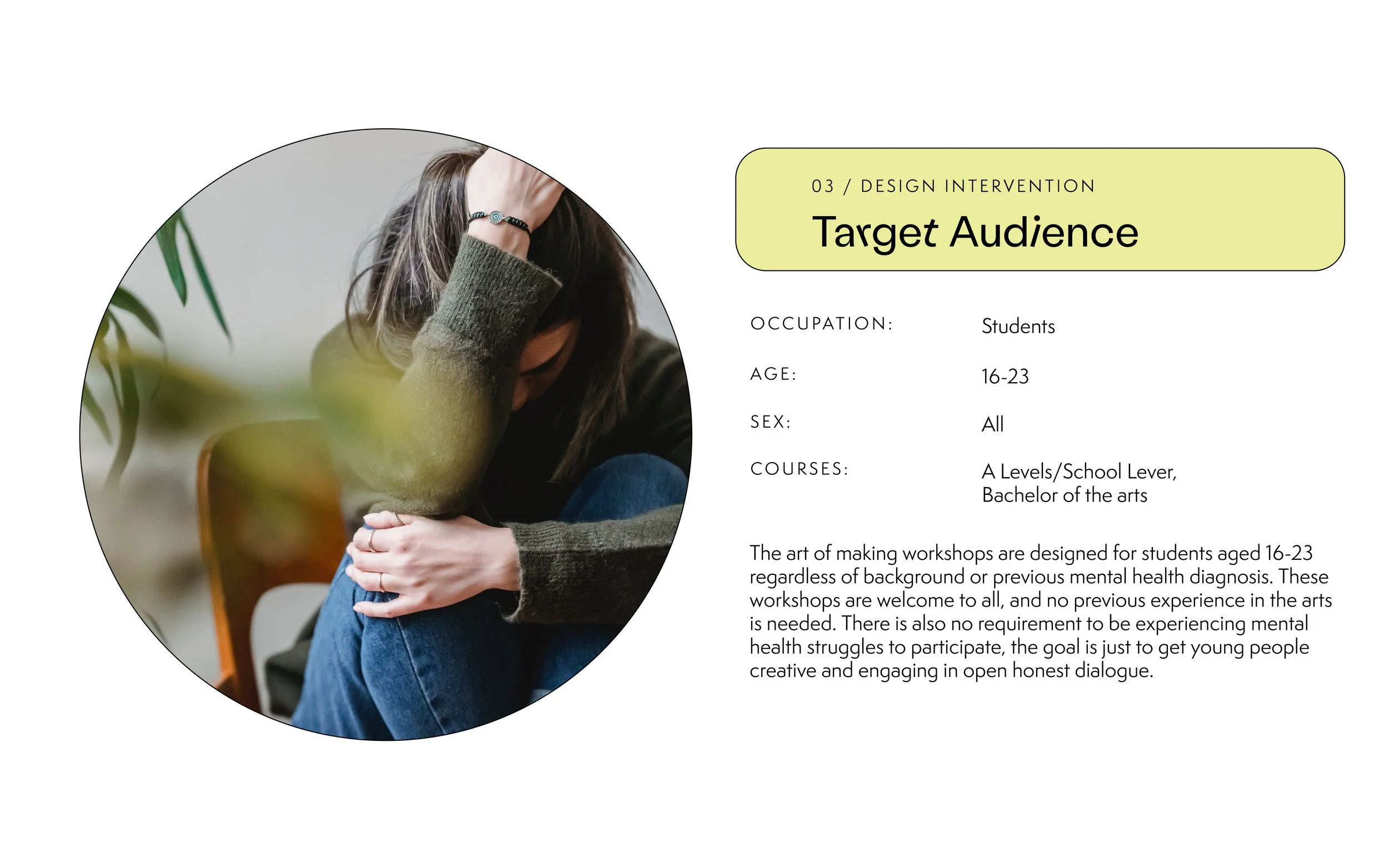
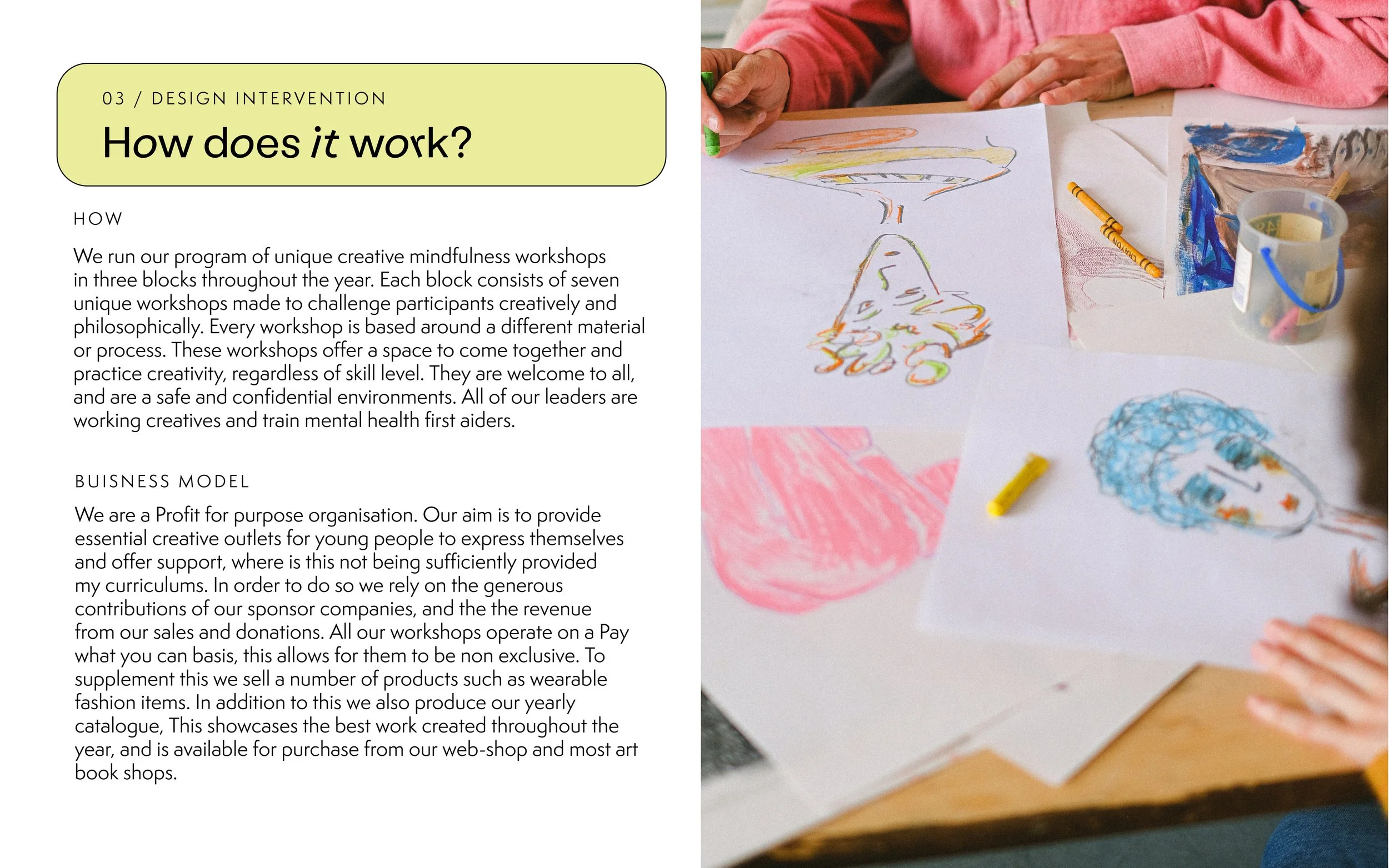
Ways of Making is a Creative Workshop Series, aimed at high school and first-year university students, that explore the idea of Creative mindfulness. Through taking part in craft-based activities such as life drawing, pottery, and printmaking, these workshops provide the space to disconnect from worries and anxieties whilst learning a new skill.
Brief: To create and identify which felt fresh and youthful, reimagining conversations around mental health as ‘cool’ , something that participants want to share with peers on social media or wear as apparel. Incorporating a hand-made quality whilst still appearing crips and modern on digital applications, It had to be robust enough to allow for a wide range of imagery to be incorporated as it was generated by the workshops.
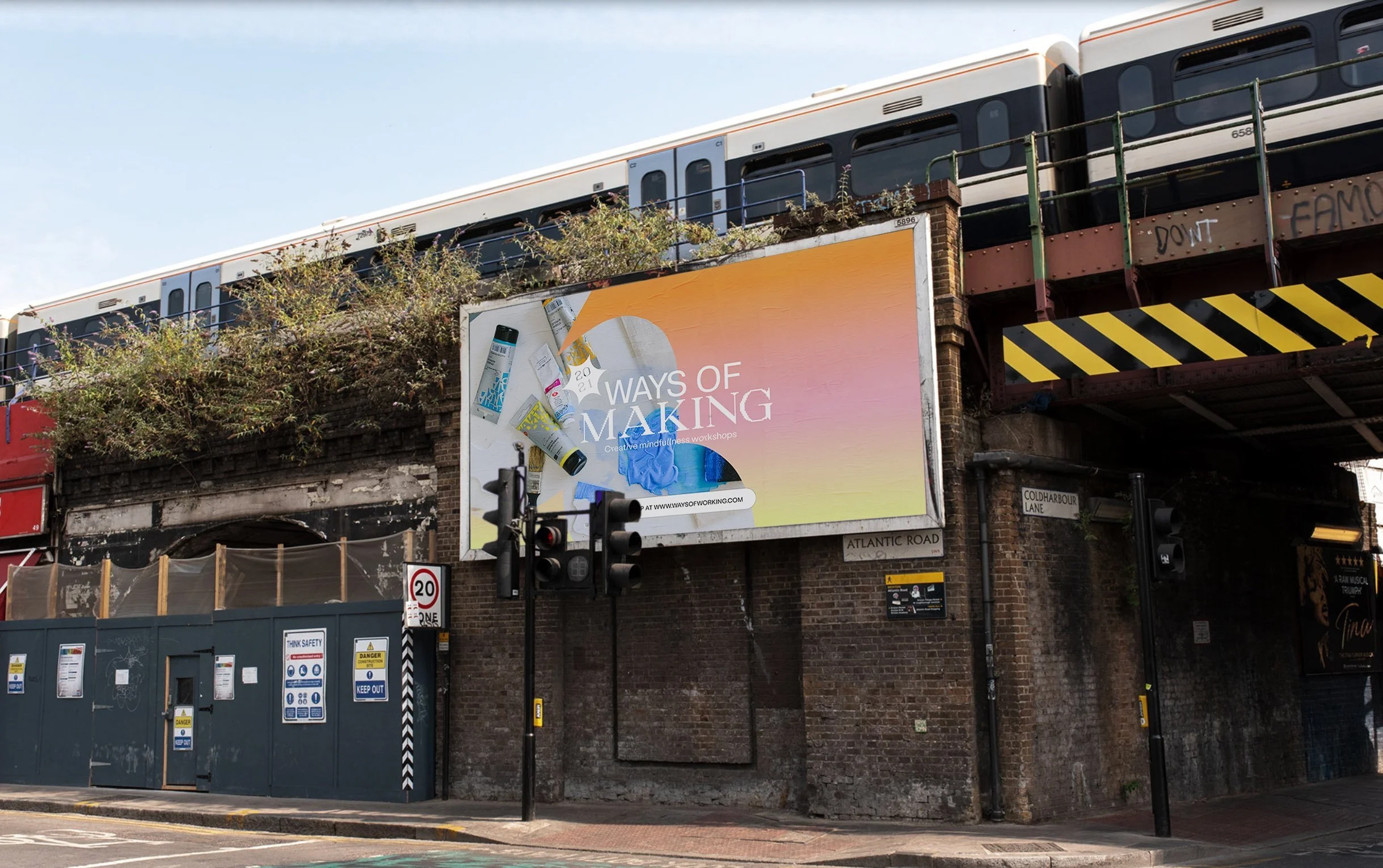
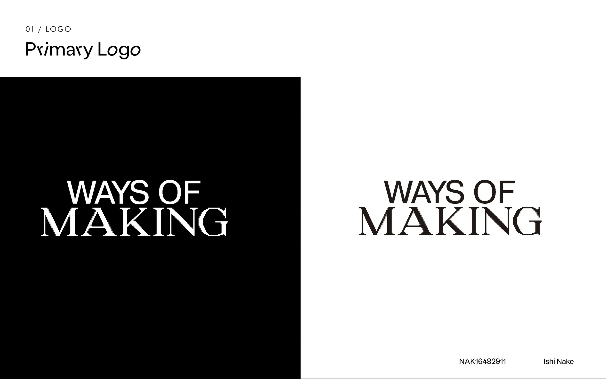
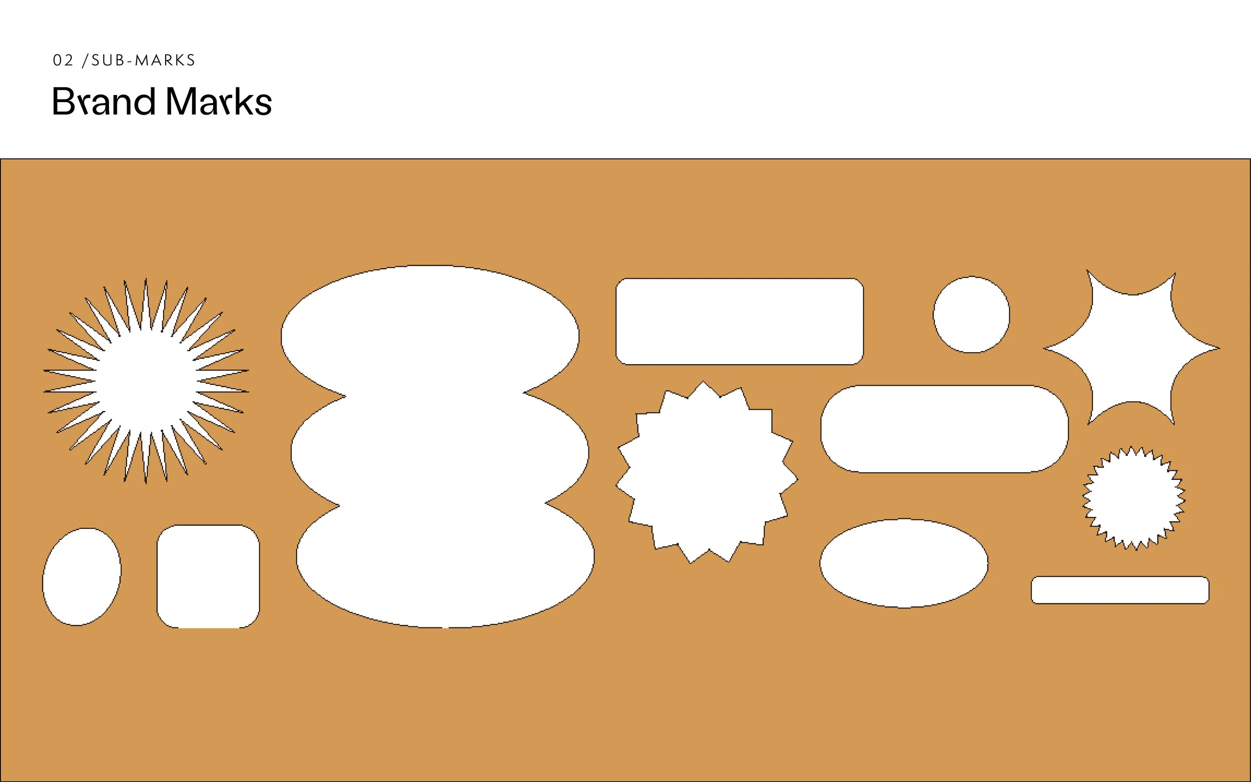
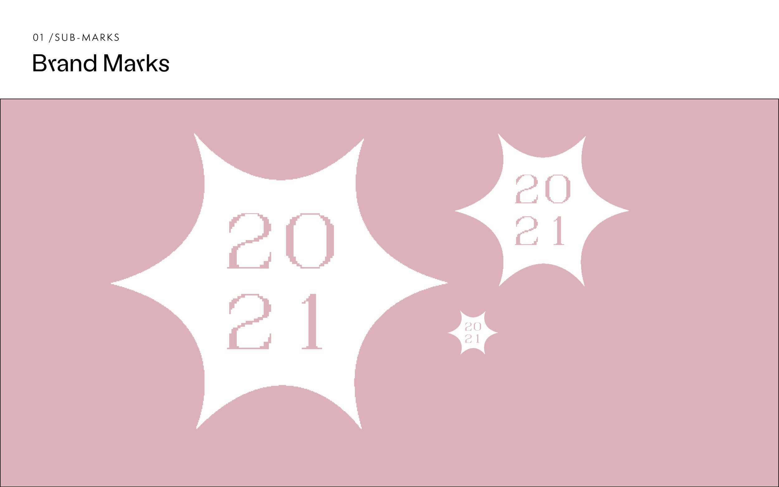
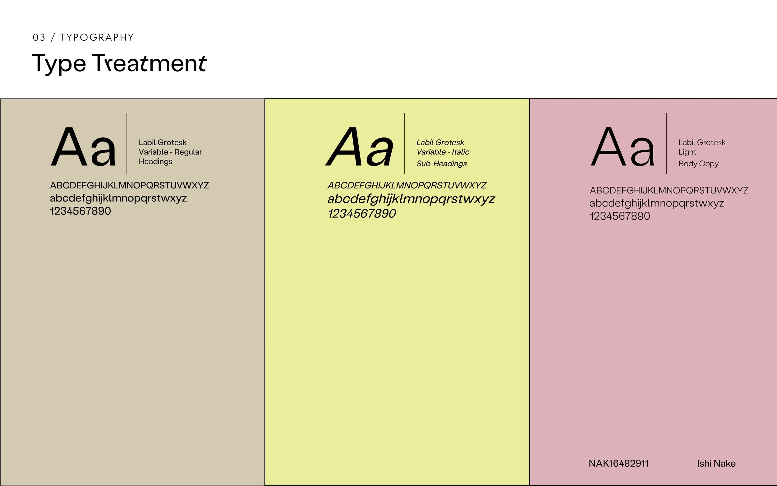
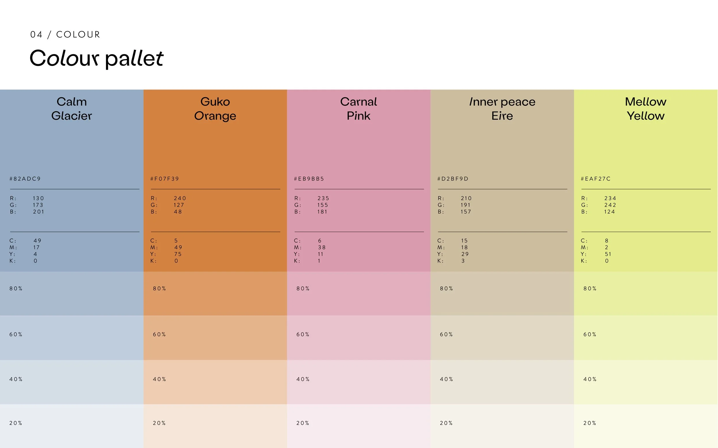
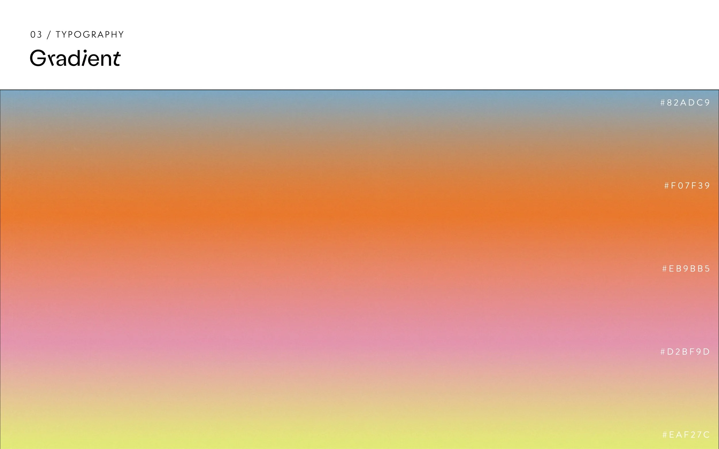
Visual elements: Labil Grotesk, a variable typeface with slanted characters nodes to the imperfect nature of craft. Pictorial elements such as smileys and star shapes represent creative spark and joy. A bold and quirky colour palette melts into a gradient, this references the melting away of worries as we engage in creative activities. Throughout the identity this gradient gets ‘erased’ to show what is underneath - clearing the visual space in this way like a clearing of the mind.
Ways of Making | Brand strategy and Guidelines
See the full presentation of the brand strategy and guidelines for this project below.


