Ibicenca | Festival Branding and collateral design
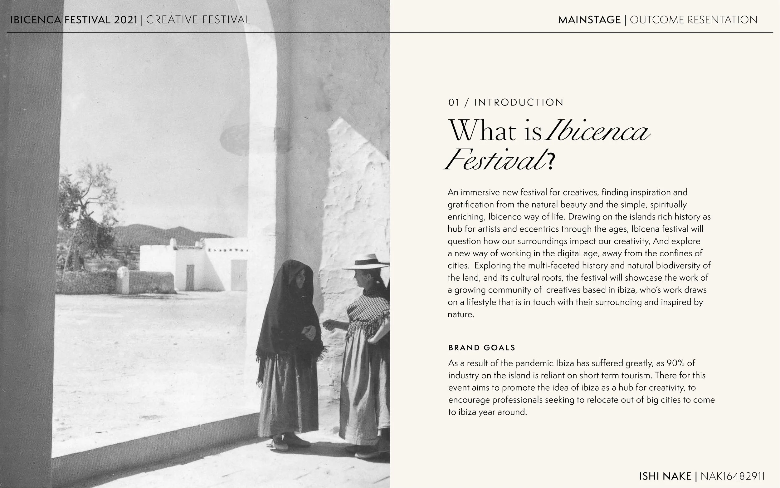
An immersive new festival for creatives, finding inspiration and gratification from the natural beauty and the simple, spiritually enriching, Ibicenco way of life. Drawing on the island's rich history as a hub for artists and eccentrics through the ages, Ibicenca festival will question how our surroundings impact our creativity. It will also explore a new way of working in the digital age, away from the confines of cities.
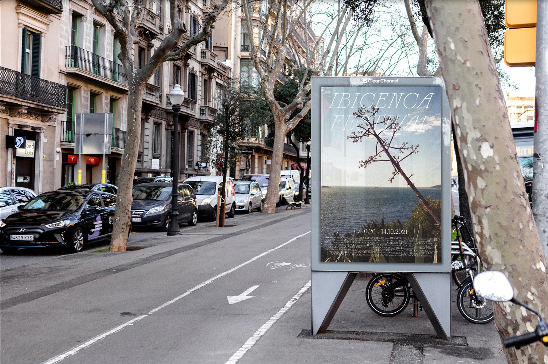
The brief: To create a unique visual identity for the festival which communicated this to a different audience than the one we normally associate with Ibiza’s role in the cultural event space. This was to be applied across a wide range of touchpoints.
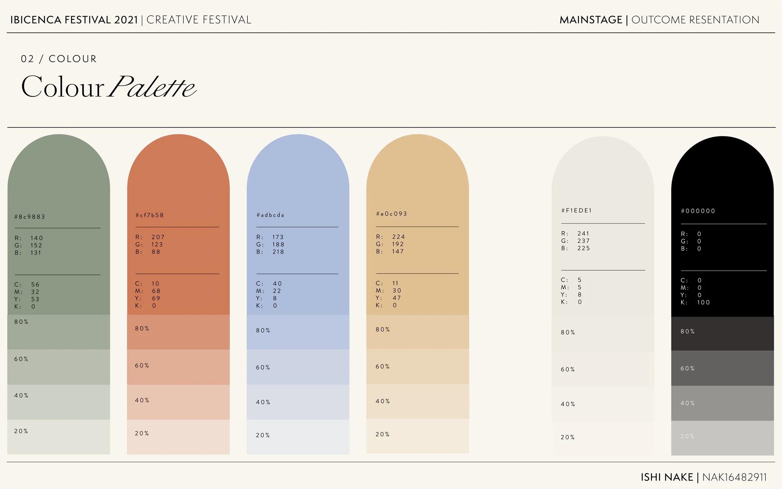
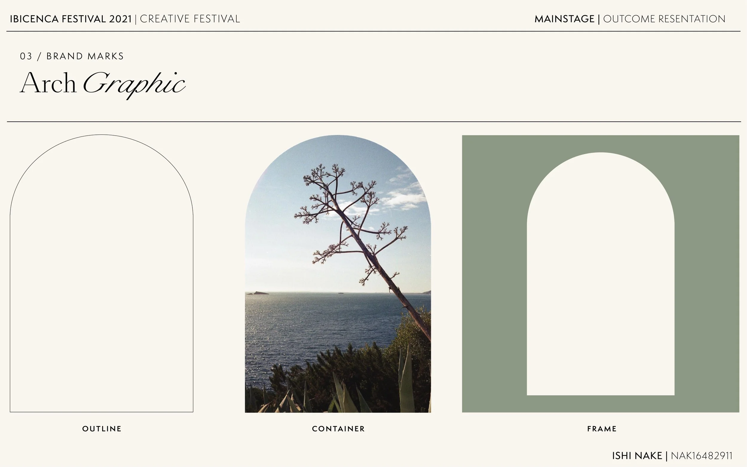
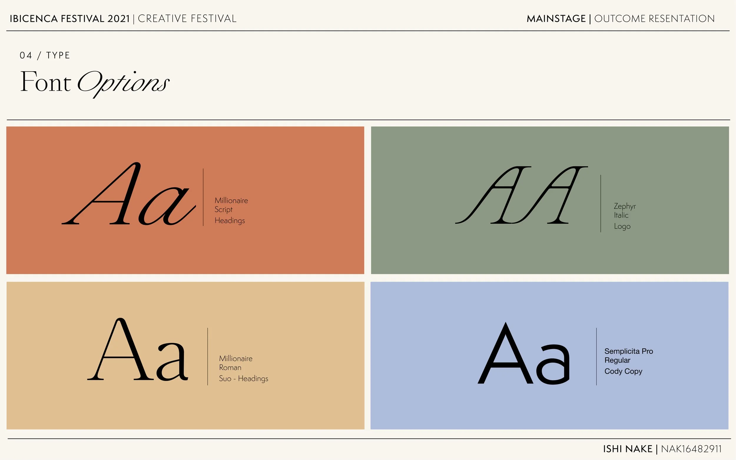
Outcome: To accomplish this I used a Modular grid system based on the unique architectural configuration of traditional farmhouses. Arches also reference architecture and act as a graphic symbol and visual vehicle. Serif typefaces reference Spanish culture and heritage, whilst the typographic layouts reference classic cinema posters. Colours were informed by an article written by Elizabeth Day about the island titled ’The three colours of Ibiza’. In it she describes that in ibiza there are always three colours; The hills are evergreen, the soil red, and the sky blue.
Ibicenca Festival | Brand strategy and Guidelines
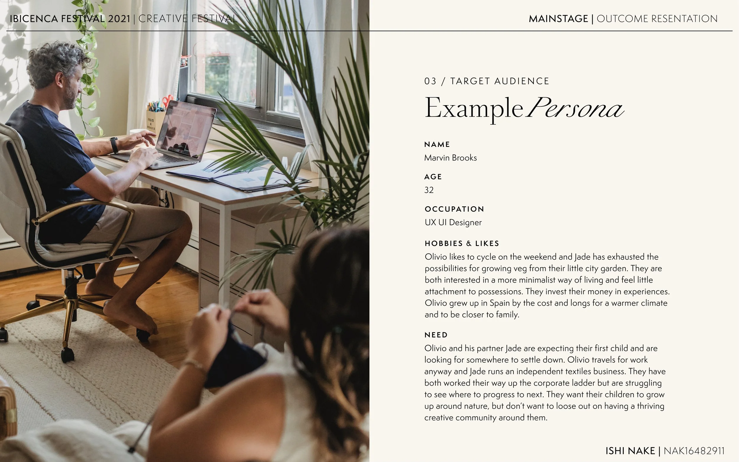
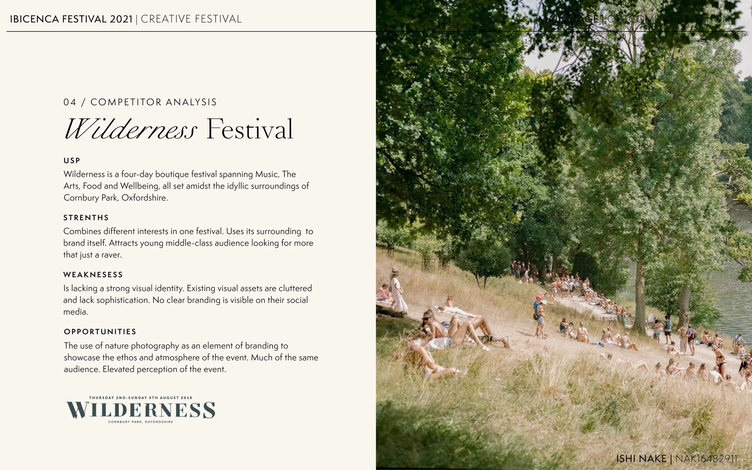
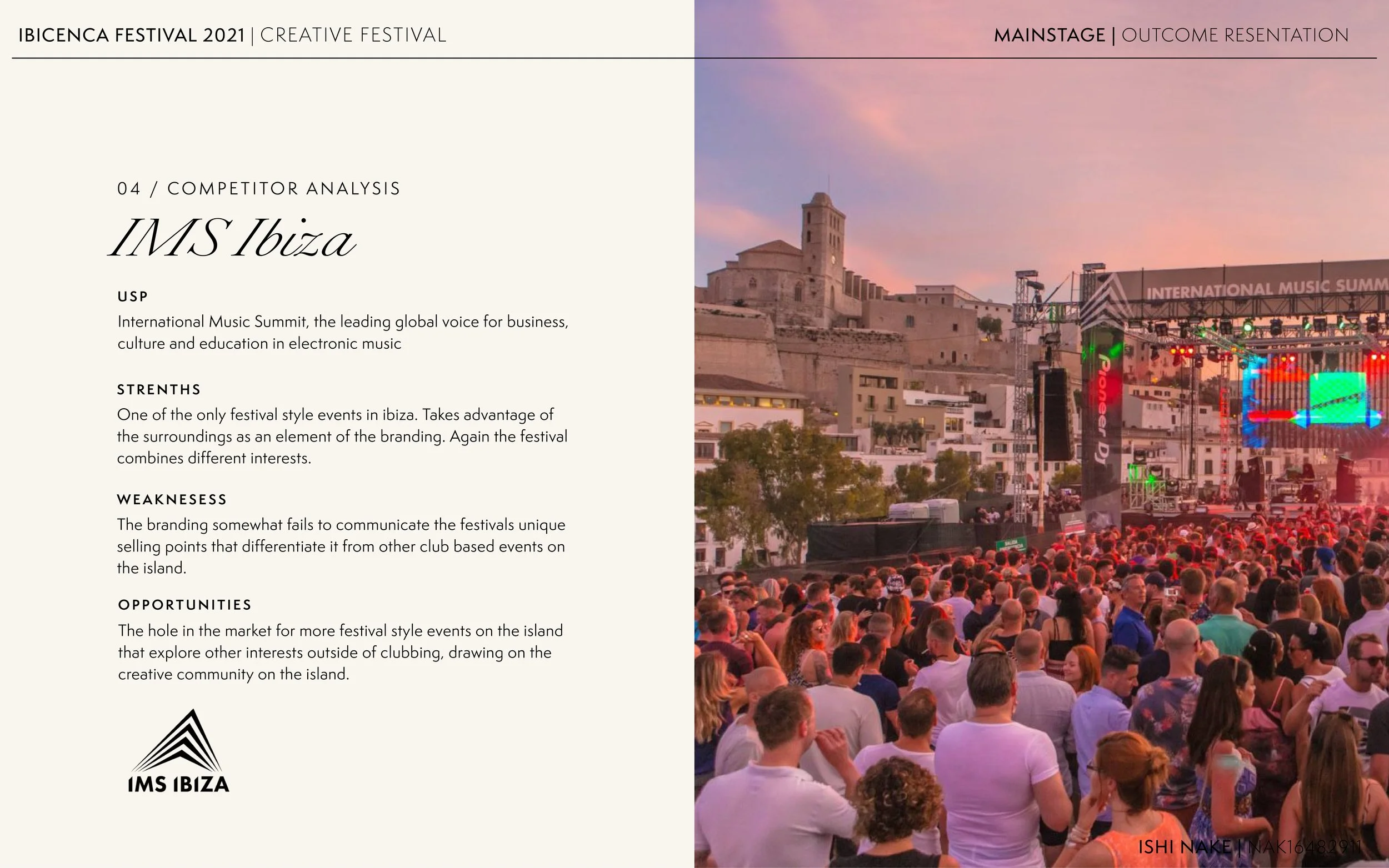
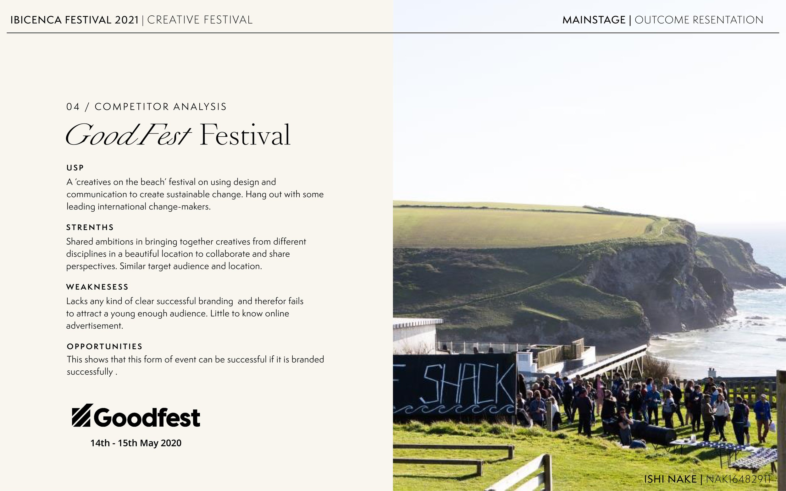
See the full presentation of the brand strategy and guidelines for this project below.


